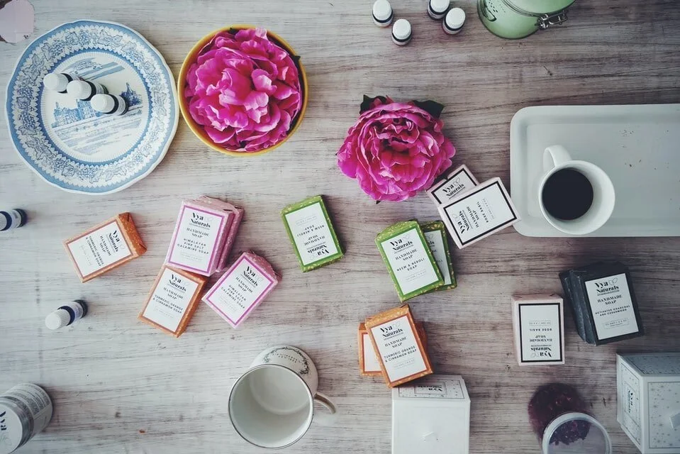
Photo by Hans Vivekon Unsplash
When planning any type of website it’s important that you approach it with your customer’s user experience in mind.
If you are selling physical products then there are some extra considerations to be made. This blog post will help you identify any areas that you need to improve on your own e-commerce site.
Branding
Make sure that your website logo, colours and fonts are consistent with your social media platforms. Will people know that they have arrived in the right place? Visitors may lose trust in your brand if the landing page bears little resemblance to what they’ve seen of you before. Leave no room for confusion.
Mobile Optimised Design
Around half of web traffic will come to your site via mobile phone or tablet so make sure it displays correctly on these devices. People shouldn’t have to pinch and zoom to see things properly. Another consideration is your website’s loading speed. Fast loading time is vital if you’re to retain visitors. If they have to wait more than a few seconds then you’re going to lose a significant number of them. Yup, people are in a hurry!
Quality Images
One of the easiest things you can do to avoid a slow website is to reduce the size of your image files. Pixelated, fuzzy pictures are the ultimate turn off for viewers so make sure you’re working with high resolution files to begin with then use a free online image compression tool such as Tinyjpg.com. This has been around for years and is still excellent though there are many others to choose from. These tools will reduce the file size of your images while retaining quality and detail to the human eye.

Keep it Simple
The simpler your website the better – you may have a lot of information and a lot of products to sell, but the cleaner your design and the easier it is for viewers to navigate and see all the info they need, the better. Give them too many choices and they’re likely to feel overwhelmed and click away. Aim for 5 or 6 options in the menu bar and avoid long, messy drop down menus.
Photo by Denisse Leon on Unsplash
Navigation
Think about the customer’s journey. Is it smooth? Are things where they’d expect to find them? Is the menu bar visible on all pages so that they can move around your site easily? Is your SHOP in a prominent place on the menu bar? Don’t try to be too clever with your page names as it can lead to confusion - Use words the customer will be expecting.
Clean Design
Your homepage should give visitors an overview of your business, telling them briefly what you’re about and what your products or services are. Use a few of your best photographs or images to entice them in. Don’t be tempted to overload the page with pictures of everything you have to offer.
Don’t Put Up Barriers
One thing I see on many sites are pop-ups which appear the second you land on their home page. I’m sure I’m not alone in finding them incredibly irritating and off putting! People want to be able to browse the website for a little while before being asked to sign up to a newsletter. Most web building platforms allow a time delay on ‘opt in’ forms, so by all means ask people if they’d like to sign up to follow your business, but give them chance to learn a bit about your brand first. As pointed out by Micah Bowers in this article on UX best practices, creating a seamless experience helps reduce cart abandonment: "Guest checkout may not be right for all eCommerce retailers, especially those whose business strategies revolve around generating customer accounts. However, it’s proven to accelerate checkout, prevent account-creation fatigue, and reduce cart abandonment."
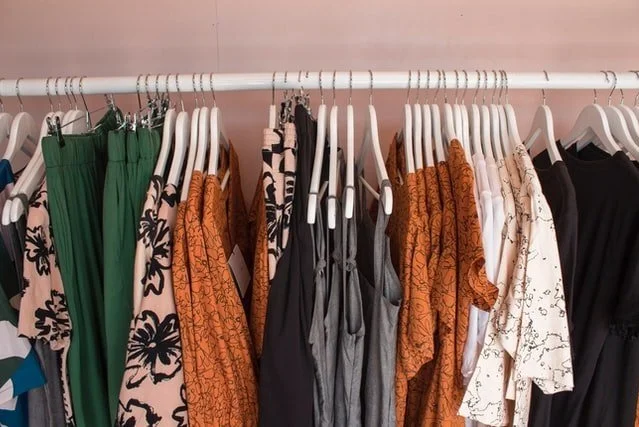
Photo by S O C I A L . C U T on Unsplash
White Space
Remember ‘less is more’. It isn’t necessary to cram too many elements into the layout of your pages – in fact you should try to avoid this. Don’t be afraid of ‘negative space’ (sometimes called white space) – this is in effect empty space on the page. Not only does this make information easier to digest, giving the elements on your page more visual impact, it also creates an air of sophistication.
Call To Action
Make sure that your CTAs steer the visitor through your site, encouraging them to take any actions you require. Include brightly coloured buttons with clear instructions in prominent places on your pages. For example ‘subscribe’, ‘shop the collection’, ‘click here’, ‘add to cart’ etc.
Trustworthy Photos
Avoid poor, badly lit photographs. This is SO off putting to visitors. A professional photoshoot isn’t always an option for everyone in the early days of running a business, but good product photography is a must if you’re expecting people to trust and buy from you.
It’s amazing what you can achieve with an iPhone camera. I used to take and edit all my own jewellery product photos and people often asked who had shot them professionally.
When taking your own pictures, always make sure your products are well lit – ideally in natural light and are all edited in a consistent way. Include multiple angles and close ups of detail. Aim for at least 3 different shots per product and try to include a lifestyle shot as your main image. By doing this you’re helping potential customers fall in love with the item if it’s presented in an attractive, aspirational way. If they are able to view all of the different images before purchasing, customers will be less likely to return items for not being as they expected.

Clear Product Information
You know your products inside out and probably assume that others may know more than they do. Take care to include all details including size dimensions and materials or ingredients. Don’t name your products in an obscure way – be sure to use keywords your potential customers are searching for. This not only helps people understand what you are selling, it also boosts your site’s SEO and will get your online shop showing up on search engines.
image by Charles Deluvio on Unsplash
Shipping Costs + Returns
Abandoned shopping carts are a serious problem for online sellers. Here are some scary 2020 stats for you…
· 61% of shoppers report leaving a transaction due to an extra cost.
· The mobile shopping cart abandonment rate is 85.65%.
· 35% of transactions were dropped because the website required the user to create an account before checkout.
When people decide to purchase from an online shop they want to know two things: “How much will it cost for delivery and how long will it take to reach me?” They don’t want to have to get to the final stages of the checkout procedure before they can learn these important details.
I would strongly advise adding ‘Shipping + Returns’ info to your web footer so that everyone can see clearly what to expect before they place an order. Explain different delivery methods, postage costs guides for various types of product and expected delivery time. Once armed with this information it’s much less likely that people will bail out before completing a purchase.
If you found this post useful then you might also like ‘Essential Elements For a Great Home Page’